It feels frustrating when your website performance is poor or the bounce rate is high. Isn’t it? Many websites fail to convert visitors into customers.
A poorly designed website can hurt your business and brand. You may lose potential leads because of slow loading speed, cluttered layouts or hard-to-read text.
These mistakes can cost you credibility and sales. Avoid these common website design mistakes to create a professional site.

Affiliate Disclaimer: I earn commission (get paid) if you click on the links and purchase a product below. My earnings do not impact the price you pay.
A clean, user-friendly design ensures visitors stay engaged. When done right, your website becomes a powerful tool for growth and trust.
Moving forward!
1. Cluttered Layouts
A cluttered layout can overwhelm visitors and make navigation difficult. Too many elements on one page confuse users, leading to frustration.

Visitors may leave quickly if they cannot find what they need. This increases your bounce rate and hurts your website’s performance.
To avoid this, focus on simplicity and balance. Use ample white space to create breathing room between elements. Ensure key information is easy to find without distractions.
Group similar elements logically for better flow. Use a clear hierarchy to guide visitors through your content. A clean layout not only improves user experience but also builds trust
2. Poor Navigation
There’s no doubt that a confusing website is a frustrating website. If your visitors can’t find what they need, they’ll quickly bounce away.
Here are some common navigation mistakes to avoid:
- Too Many Menu Items: Don’t overwhelm your visitors with a cluttered menu. Keep it simple and focused on the most important sections.
- Unclear Labels: Use clear and concise labels for your menu items. Avoid vague terms like “Services” and opt for more specific labels like “Web Design” or “SEO Services.”
A well-organized navigation structure can significantly improve your website’s user experience. So, take the time to review your navigation and make sure it’s easy to understand.
3. Not Mobile-Friendly
Let’s face it, most people browse the web on their phones. If your website isn’t mobile-friendly, you’re missing out on a huge chunk of potential customers.
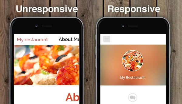
A non-mobile-friendly site is frustrating to use. Visitors will quickly bounce away, hurting your website’s ranking in search engines.
With a mobile-friendly site, you’re making it easier for people to find and engage with your content. It leads to a better user experience, higher conversions, and more business.
Tools like LeadPages can help you create mobile-friendly landing pages with ease. So, don’t delay. Make your website mobile-friendly today!
4. Slow Loading Times
A slow website is like a store with a grumpy cashier – people will walk out! Slow load times can frustrate visitors and drive them away.
What’s slowing down your site?
Often it’s large, unoptimized images. They take forever to load, especially on mobile devices. Your web host also impacts site speed. A slow host can make your website feel sluggish.
How to speed things up:
- Compress Images: Use tools like TinyPNG to shrink image file sizes without losing quality.
- Choose a Good Web Host: HostGator and Bluehost are popular choices for reliable, high-speed hosting.
A faster website means happier visitors and better search engine rankings. So let’s get your site running at top speed!
5. Inconsistent Design Elements
Mismatched fonts, color schemes, and inconsistencies hurt your brand identity. They confuse visitors and make your website look unprofessional.
Consistent design elements create a cohesive and reliable brand image. To maintain uniformity, start by choosing a color palette.
Stick to a few colors that represent your brand. Use these colors consistently across all pages. Next, select fonts that reflect your brand’s personality. Limit your website to two or three fonts.
Ensure text styles are the same for similar content. Create a style guide for your website. Include guidelines for colors, fonts, button styles, and layout.
Review your website regularly to ensure adherence to the style guide. Uniform design elements create a seamless user experience.
6. Lack of a Clear Call-to-Action (CTA)
Hidden or poorly designed CTAs confuse visitors. Without a strong CTA, users may leave your site without taking any action. A well-placed CTA guides users and encourages engagement.
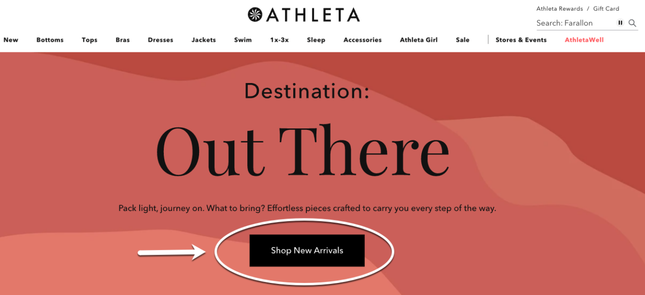
Place your CTA above the fold so it’s visible immediately. Use a contrasting color to make it stand out. The text should be clear and action-oriented.
Phrases like “Sign Up Now” or “Get Started Today” work well. Test different variations to find the most effective option. Change the text, color, or placement and monitor results.
Regular reviews help keep your CTAs effective. LeadPages can help design impactful CTAs. Their tools make creating and testing CTAs simple.

7. Overuse of Pop-Ups
Pop-ups can be a great way to capture leads or promote special offers. However, too many pop-ups can be annoying and drive visitors away.
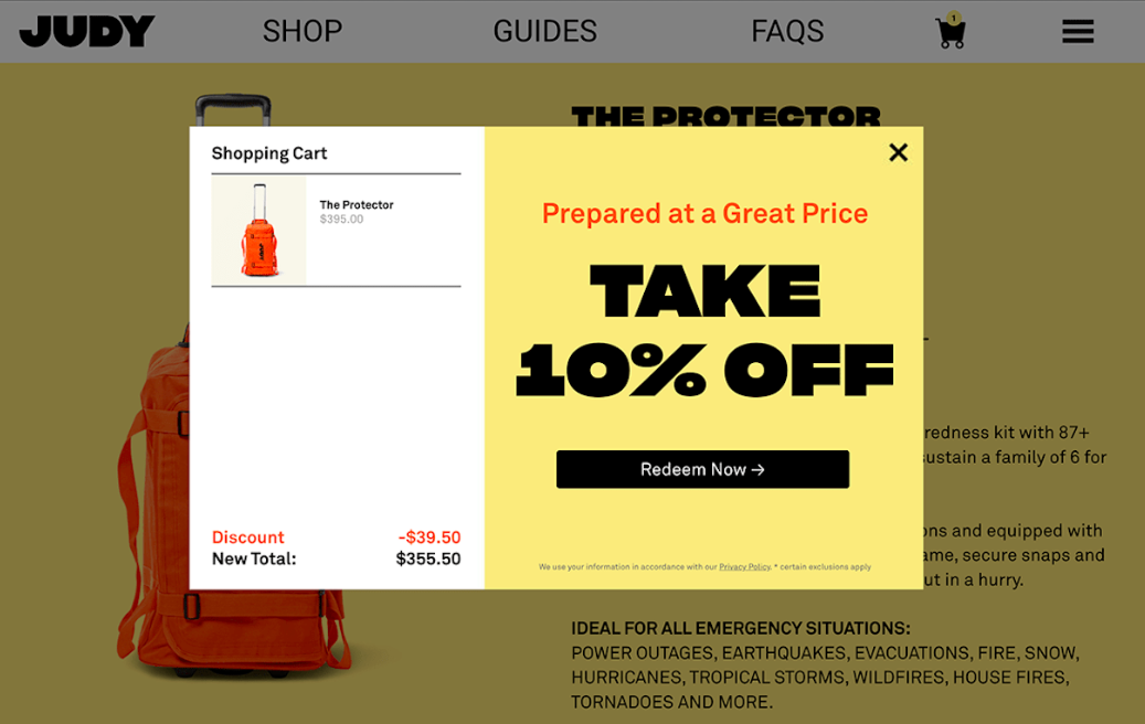
If you must use pop-ups, be strategic. Use them sparingly and only when they add value to the user experience.
Try using exit-intent pop-ups, which appear when a user is about to leave your site. Remember, a good website experience is essential for building trust and converting visitors into customers.
8. Ignoring SEO Best Practices
SEO is crucial for attracting organic traffic. Don’t overlook these common SEO mistakes:
- Image Alt Text: Always add descriptive alt text to your images.
- Site Structure: Ensure your website has a clear and logical structure.
- Mobile-Friendliness: Make sure your website looks and functions well on mobile devices.
- Page Load Speed: Optimize your website for fast loading times.
9. Low-Quality Visual Content
Poor quality images can seriously damage your website’s credibility. Let’s say you’re visiting a website with blurry or irrelevant pictures. It doesn’t exactly scream professionalism, right?

Instead, use high-quality, relevant images that complement your content. This not only makes your website look more polished, but it also helps your visitors understand your message better.
Keep in mind, your website’s visuals are a reflection of your brand. So, choose images that are visually appealing and align with your brand’s style.
10. Failure to Use White Space
White space plays a crucial role in improving readability and focus. It helps separate different elements and prevents your page from feeling cluttered.
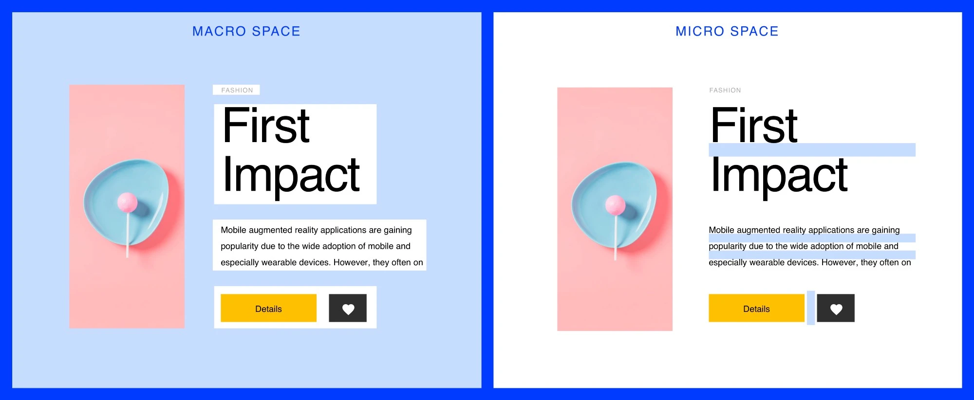
Too much white space can make your site look empty and unfinished. On the other hand, too little white space makes content hard to read and overwhelming.
Proper use of white space creates a balanced and visually appealing layout. It allows users to focus on the key messages and navigate your site easily.
Download Your Free e-Book
5 Simple Ways to Create Website & Landing Pages
Make sure your text, images, and other elements have enough breathing room. It highlights important sections and improves overall readability.
Conclusion
Let’s wrap it up! Avoid those common website design mistakes to improve user experience and boost results. A clear layout, strong calls-to-action, and fast loading times are essential.
Each element on your site should guide visitors toward taking the next step. Focus on simplicity and prioritize your audience’s needs.
Take time to audit your site for issues and make improvements. Don’t forget, a great website can set your business apart and leave a lasting impression.


