

The good news? Making a site mobile-friendly isn’t complicated. With the right design, layout, and optimization, you can create a smooth experience for users.
In this guide, we’ll cover the key steps to designing a mobile-friendly website. From responsive design to fast loading speeds, you’ll learn everything you need. Let’s get started!
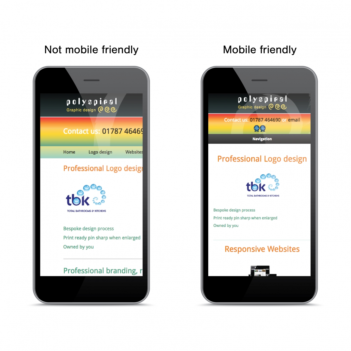
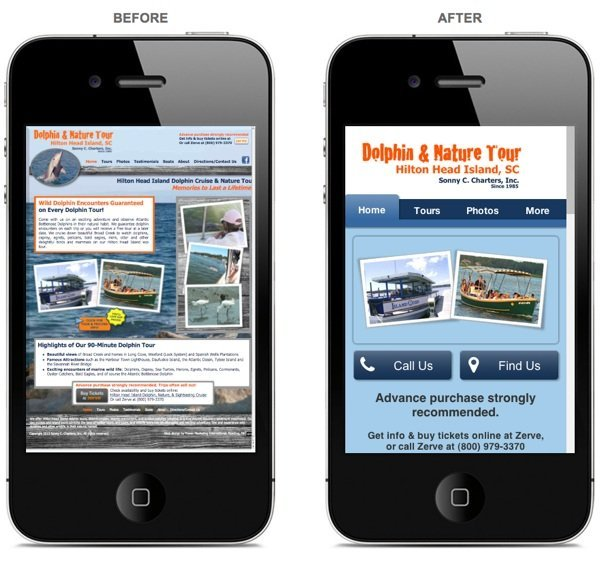
What Is a Mobile-Friendly Website, and Why Does It Matter?
A mobile-friendly website adapts to different screen sizes and devices. It looks good, loads fast, and provides an easy-to-use website experience on smartphones and tablets.
A key feature is responsive design, which adjusts layouts automatically. This ensures that text, images, and buttons stay readable and accessible.
Why does this matter? Because mobile users now dominate internet traffic. If your site isn’t optimized, visitors will struggle to navigate it. They may leave and never return.
A good website experience keeps users engaged and improves conversions. Search engines like Google reward mobile-friendly websites with better rankings.
Without responsive design, your site could lose visibility and traffic. A slow, hard-to-use website drives potential customers away.

Why Mobile-Friendly Websites Help Your Business Growth
A mobile-first website is key to reaching more customers online. Most people browse and shop with smartphones. If your business website isn’t mobile-friendly, you’re losing potential buyers.
Google prioritizes mobile-friendly sites in search rankings. A poor mobile experience can hurt your Google ranking. Less visibility means lower website traffic and fewer customers.
A mobile-friendly website keeps visitors engaged. It loads fast, looks great, and is easy to navigate. If customers struggle to use your site, they’ll leave and visit a competitor instead.
Higher website traffic leads to better conversions. A smooth experience makes visitors more likely to buy or contact you.
A mobile-first website helps you attract, retain, and convert more customers online. Don’t let a poor design hold your business back!
The Basics of a Mobile-Friendly Website Design
A user-friendly website should be easy to navigate on any device. A mobile-friendly layout ensures everything looks great on smaller screens.
Key Features of an Easy Website Design:
✔ Responsive design: Adjusts content to fit any screen size.
✔ Big buttons: Helps users tap without frustration.
✔ Easy-to-read text: No squinting or zooming needed.
✔ Fast loading speed: A slow site drives visitors away.
✔ Simple navigation: Menus should be clear and easy to use.
✔ Thumb-friendly design: Users should scroll and click effortlessly.
A mobile-friendly layout improves the website speed and keeps visitors engaged. If a site loads slowly, people will leave before it fully appears.
With the right easy website design, visitors stay longer and convert better. A responsive design isn’t just an option; it’s essential for success!
How to Make Your Website Load Fast on Mobile
A fast-loading website is the key to keep visitors engaged. If your site is slow, people will leave before it even loads.
Website speed also affects your Google ranking and overall website performance. Here are some tips for mobile website optimization:
- Use smaller images: Large images slow down loading time.
- Limit videos: Too many videos make a site heavy and sluggish.
- Choose a good hosting service: Reliable hosting improves website performance.
- Enable browser caching: Stores data so pages load faster.
- Minimize unnecessary code: Too many scripts slow your site.
A fast-loading website improves user experience and boosts conversions. People expect quick results, especially on mobile.
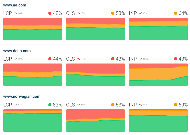
Mobile website optimization ensures smooth browsing and better website performance. Speed matters. So, make your site fast, or risk losing visitors!
How to Make Simple Navigation for Visitors
A user-friendly website needs easy website navigation, so visitors can find information fast. If menus are confusing, people will leave without exploring your site.
A mobile website menu should be short and clear, ensuring visitors don’t feel overwhelmed. Adding clear buttons makes it easy for users to know where to click.
A search bar is also essential. It helps visitors find what they need quickly without scrolling endlessly. Keep menus simple to improve the website design and ensure a smooth experience.
Avoid too many menu items because too many choices confuse users. A sticky navigation bar helps by keeping the menu visible while scrolling.
When easy website navigation is in place, visitors stay longer and engage more with your content.

A mobile website menu should always be effortless to use, guiding users naturally through your site. The easier the navigation, the better the user experience.
Avoid Pop-Ups and Annoying Ads on Mobile
Pop-ups can ruin a website experience by frustrating visitors. On mobile, they cover the screen and make navigation difficult.
Many users close a site immediately when a pop-up appears. Use Non-intrusive design to keep visitors engaged. Instead of pop-ups, use mobile-friendly ads that don’t interrupt browsing.
A small banner at the top or bottom works better. These ads deliver the message without blocking content. Exit-intent pop-ups can also be less intrusive if used wisely.
A non-intrusive design improves user experience and keeps people on your site longer. Google also penalizes sites with aggressive pop-ups, and lowers search rankings.
Avoiding pop-ups doesn’t mean losing conversions. Use mobile-friendly ads like slide-ins or subtle notifications. A clean, distraction-free site allows visitors to engage with your content.

Test Your Website on Mobile
Mobile website testing ensures your site works smoothly on all devices. A site that looks good on a desktop may not work well on mobile.
Poor design can hurt website performance and drive visitors away. Use a website checker like Google’s Mobile-Friendly Test to spot issues.

This tool shows if your site is responsive and easy to use. Also, test your site on different phones and screen sizes. Some layouts may break on smaller screens.
Regular mobile website testing helps improve user experience. A fast, responsive site keeps visitors engaged and boosts website performance.

Conclusion
A mobile-friendly site improves user experience and boosts engagement. A well-optimized site loads fast, has simple navigation, and avoids intrusive pop-ups.
Follow a mobile website checklist to provide a smooth experience for visitors. Before launching, run a final website test to check design and speed.
Use tools like Google’s Mobile-Friendly Test to spot any issues. Testing on different devices helps ensure a seamless experience for all users.
Consistent website optimization keeps your site mobile-friendly over time. A fast, responsive, and easy-to-use website attracts more visitors and improves conversions.


